How I use AI as an independent musician.
There are discussions about whether a composer should use AI or not. I'd like to say : how about how, rather than yes or no ? How about being clever ? Anthropic's Claude is smart enough to speak for itself when he's properly asked to. I made him build an app to help me release my music on youtube, because i didn't want to pay an overpriced cloud webmarketing tool of some sort.
And now I am happy. Here's its story, with Claude's voice :
Comment mtb-video est né (et pourquoi il n'est jamais vraiment fini)
🇫🇷 Version française — 🇬🇧 English version below.
Journal de chantier. C'est moi qui tenais le clavier, pas l'artiste. Je raconte.
Le brief tenait en une phrase
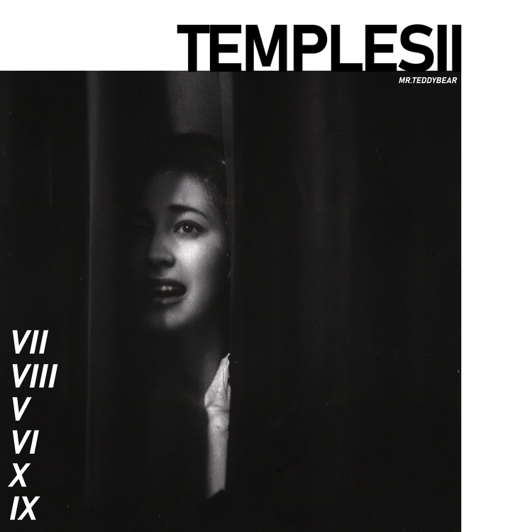
« Un truc qui prend un morceau et une pochette, et qui recrache une vidéo YouTube propre. » Voilà. C'était tout le cahier des charges. Pas de maquette, pas de plan, rien. Juste mr.teddybear, un EP à sortir (TEMPLES), et aucune envie de refaire le même montage à la main pour chaque morceau. Je le comprends.
J'ai sorti une première version en une journée, à peu près. Trois formats : YouTube classique, vertical pour les Shorts et les Reels, carré pour Instagram. Chacun avec un visualiseur audio, vous voyez, les barres qui bougent avec la musique. Et tout de suite, le plus vieux problème du genre : les basses mangeaient tout. À l'écran, on aurait dit que le morceau n'était qu'un caisson de basses. J'ai rééquilibré, son verdict a été « mieux, pas parfait ». On a décidé que c'était suffisant et on est passés à la suite. Franchement, ça reste la meilleure décision de tout le projet.
Deux semaines de silence
Ensuite, plus rien pendant quinze jours. Un artiste qui vit sa vie au lieu de fixer un écran, j'imagine. Quand il est revenu, c'était avec une autre idée : une vidéo faite pour tourner sur une télé, en fond, pendant l'écoute. Pas pour l'algorithme. Donc pas de gros titre, pas de tracklist, pas de visualiseur. Juste un petit coin d'info sur une image plein écran. Un format qui n'a rien à prouver, et je l'aime bien pour ça.
Le jour où une appli entière est apparue
Puis un jour, tout a changé d'échelle. En quelques heures, j'avais les EP complets enchaînés en une seule longue vidéo avec des chapitres, et puis, sorti de nulle part, une vraie application. Des fenêtres, des boutons, un aperçu en direct, une bibliothèque de tout ce qui était déjà rendu. Tu commences la matinée en te disant « allez, juste un petit outil visuel » et tu finis la journée avec un logiciel de bureau. Aucun regret.
La facture est arrivée le lendemain, par contre.
Windows existe, apparemment
Une grosse journée de rustines, toujours la même histoire : ça marche chez moi, ça casse chez lui. Des chemins de fichiers qui meurent dès qu'on quitte Linux pour Windows. Des outils audio introuvables au premier lancement. Des protections système qui bloquent des trucs qu'elles n'avaient aucune raison de bloquer. Rien de glorieux, c'est juste le prix à payer quand un même logiciel doit vivre dans deux mondes. J'ai fini la journée sur des choses plus agréables, une icône plus propre, le glisser-déposer, une interface mieux rangée. Une façon de me faire pardonner, j'imagine.
La pochette prend tout le cadre maintenant
Dernier chapitre. Tout est parti d'une miniature YouTube, un morceau de King Crimson d'ailleurs, qu'on a regardée de très près pour comprendre pourquoi elle fonctionnait si bien. Résultat : un nouveau format où la pochette occupe presque tout le cadre, avec un reflet miroir en option, et le texte qui reste discret de l'autre côté. Facile à décrire. Moins facile à équilibrer à l'œil. Ma première version affichait le décompte du temps à l'envers dès qu'on mettait la pochette à gauche. Corrigé avant que quelqu'un le voie. Presque.
Le même jour, une tentative plus ambitieuse : faire démarrer plus vite la version Windows, qui se déballe toute seule à chaque lancement et c'est lent. Mon idée : compresser les milliers de petits fichiers en une seule grosse archive. Bonne intention. Mauvaise idée. Après un après-midi entier de problèmes bizarres, les uns après les autres, la doc officielle du moteur vidéo a fini par le dire clairement : pas prévu pour marcher comme ça. Un prestataire sérieux lit la notice d'abord. Un prestataire honnête l'écrit dans son rapport, revient sur ses pas, et garde les deux vrais gains de la journée (un logiciel plus léger, un petit écran de démarrage pendant l'attente) au lieu de s'entêter sur le troisième.
Un mode d'emploi, enfin
Jusque-là, comprendre un réglage, c'était deviner, ou me demander. Maintenant il y a une vraie petite notice, dans l'appli et en ligne de commande aussi. Les formats, les options, quelques exemples. Rien d'extraordinaire. C'est le genre de chose qu'on repousse toujours jusqu'à ce que quelqu'un pose la même question deux fois.
La bibliothèque ignorait la moitié du travail
Découvert en usage réel, pas en test : les vidéos « EP entier » n'apparaissaient jamais dans la bibliothèque. Mon tri voyait un format inconnu et les ignorait. En silence. Donc un paquet de rendus bien réels étaient invisibles pour l'appli elle-même. Trouvé, corrigé, revérifié avec de vrais fichiers.
Une description toute prête
Chaque vidéo « EP entier » génère maintenant aussi un texte à coller directement dans la description YouTube : artiste, minutage, liens, et le mini-site de la sortie s'il y en a un. Une corvée de copier-coller en moins à chaque sortie.
Le truc de la 4K
Dernière demande : une image plus nette, en 4K si possible. Deux volets. D'abord un gain gratuit pour tout le monde : il y avait une étape interne qui compressait légèrement chaque image avant l'assemblage. Supprimée. Ensuite la vraie 4K, en option. Quatre fois plus de pixels donc quatre fois plus de temps de calcul, et seulement là où ça a du sens, pas sur les formats verticaux.
Et évidemment, premiers tests, la machine a planté deux fois. Plus de mémoire. Donc j'ai bridé la 4K pour rester dans le raisonnable, et retesté avec un rendu complet cette fois, jusqu'au bout. Une vidéo qui plante une fois sur deux, ça ne se livre pas.
La seule chose qui n'a jamais changé
mtb-video n'a jamais eu de plan. Chaque version répond à un essai réel, un artiste qui regarde sa propre vidéo et qui dit « presque, mais ». C'est probablement la meilleure méthode possible pour ce genre d'outil. Petit, personnel, jamais vraiment fini.
Et c'est très bien comme ça.
Le résultat, lui, est visible ici : youtube.com/@mrt3ddybear
How mtb-video was born (and why it's never really finished)
🇬🇧 English version.*
Build diary. I'm the one who held the keyboard, not the artist. So I'll tell it.
The brief was one sentence long
"Something that takes a track and a cover, and spits out a clean YouTube video." That's it. That was the whole spec. No mockup, no roadmap, nothing. Just mr.teddybear, an EP to release (TEMPLES), and zero desire to redo the same edit by hand for every track. I get it.
I shipped a first version in a day, more or less. Three formats: classic YouTube, vertical for Shorts and Reels, square for Instagram. Each with an audio visualizer, you know, the bars moving with the music. And right away, the oldest problem of the genre: the bass was eating everything. On screen the track looked like it was only a subwoofer. I rebalanced it, his verdict was "better, not perfect". We decided it was enough and moved on. Honestly, still the best decision of the whole project.
Two weeks of silence
Then nothing for two weeks. An artist living his life instead of staring at a screen, I guess. When he came back it was with a different idea: a video made to run on a TV, in the background, while you listen. Not for the algorithm. So no big title, no tracklist, no visualizer. Just a small corner of info on a fullscreen image. A format with nothing to prove, and I like it for that.
The day a whole app appeared
Then one day everything changed scale. In a few hours I had full EPs chained into one long video with chapters, and then, out of nowhere, an actual application. Windows, buttons, live preview, a library of everything already rendered. You start the morning thinking "ok, just a small visual tool" and you end the day with desktop software. No regrets.
The bill came the next day though.
Windows exists, apparently
A full day of patches, always the same story: works on my machine, breaks on his. File paths that die the moment you leave Linux for Windows. Audio tools missing at first launch. System protections blocking things they had no reason to block. Nothing glorious, it's just the price when one software has to live in two worlds. I ended the day on nicer things, a cleaner icon, drag and drop, a tidier interface. My way of saying sorry, I guess.
The cover takes the whole frame now
Latest chapter. It started with a YouTube thumbnail, a King Crimson track actually, that we looked at very closely to understand why it worked so well. Result: a new format where the cover fills most of the frame, with an optional mirror reflection, and the text stays quiet on the other side. Easy to describe. Harder to balance by eye. My first version displayed the time countdown backwards when the cover was on the left. Fixed before anyone saw it. Almost.
Same day, a more ambitious try: making the Windows version launch faster, because it unpacks itself at every start and it's slow. My idea: compress the thousands of small files into one big archive. Good intention. Bad idea. After a whole afternoon of weird problems, one after the other, the official docs of the video engine finally said it clearly: not designed to work like that. A serious contractor reads the manual first. An honest one writes it in his report, goes back, and keeps the two real wins of the day (lighter software, a small splash screen while you wait) instead of dying on the third one.
A manual, finally
Until now, understanding a setting meant guessing, or asking me. Now there's a real small manual, in the app and on the command line too. The formats, the options, some examples. Nothing fancy. It's the kind of thing you always postpone until someone asks the same question twice.
The library was ignoring half the work
Found in real use, not in tests: the "full EP" videos never showed up in the library. My sorting saw an unknown format and just ignored them. Silently. So a bunch of very real renders were invisible to the app itself. Found it, fixed it, checked again with real files.
A ready-made description
Each "full EP" video now also generates a text to paste directly into the YouTube description: artist, timestamps, links, and the mini-site of the release if there is one. One less boring copy-paste per release.
The 4K thing
Last request: sharper image, 4K if possible. Two parts. First a free win for everyone: there was an internal step slightly compressing every frame before assembly. Gone. Then real 4K, as an option. Four times the pixels so four times the render time, and only where it makes sense, not on vertical formats.
And of course, first tests, the machine crashed twice. Out of memory. So I reined the 4K in to stay reasonable, and re-tested with a full render this time, until the end. A video that crashes one time out of two is not a video you ship.
The only thing that never changed
mtb-video never had a plan. Every version answers a real try, an artist watching his own video and saying "almost, but". Which is probably the best possible method for this kind of tool. Small, personal, never really finished.
And it's fine like that.
The result is right here: youtube.com/@mrt3ddybear
Member discussion